As the world watched COVID-19 grow from a mysterious virus in far-off places to a planetary pandemic, news outlets worked hard to keep the world informed on how, where and why it was spreading. At the start of the outbreak, Matthew Conlen, a Ph.D. student in the Allen School’s Interactive Data Lab, was working as a graphic/multimedia editor for the New York Times helping with their elections forecasting application, also known as “The Needle.” He switched gears to contribute to the paper’s coverage of the novel coronavirus as it enveloped the globe — work that contributed to stories that earned the New York Times a Pulitzer Prize in Public Service for, in part, filling “a data vacuum that helped local governments, healthcare providers, businesses and individuals to be better prepared and protected.”
Conlen’s forte is creating interactive data visualizations that do precisely that: help the public to comprehend what is happening in the country and throughout the world. In this particular case, he led a data collection effort on COVID-19 in nursing homes, and he also worked with epidemiologists and modelers to give readers an understanding of what could happen in different scenarios when schools reopened, as the vaccine rolled out and when the U.S. could reach herd immunity.
“Data journalism can provide a valuable perspective on our world, complementing traditional narrative reporting with additional context, more comprehensive accounts and increased audience engagement,” Conlen’s advisor and Allen School professor Jeffrey Heer said. “Interactive visualizations rank among the most visited and revisited pieces published by major news outlets. Though data visualization on the web has largely ‘come of age,’ a major remaining challenge is empowering more journalists — as well as educators and others — without an extensive technical background to author and collaborate on interactive articles.”
Conlen’s work, Heer said, leads on all of these fronts: publishing data-driven news at multiple major outlets and via Parametric Press, which Conlen co-founded, while simultaneously researching at the Allen School, which has resulted in new open-source languages and tools that make these articles easier to create.
“It’s a virtuous cycle of research and practice,” Heer said.
After earning dual bachelor’s degrees in computer science and applied mathematics, Conlen began working on a big data analytics platform at an advertising technology, or ad tech, company. Despite interesting technical challenges, he found more fulfilling work in journalism, using digital news tools at the Huffington Post, FiveThirtyEight, The New Yorker and NASA’s earth science communications team. He became interested in data visualization because it combines math and statistics with tough programming challenges and a creative design aspect. This combination of technical and creative elements is, he notes, hard to come by in other fields.

“I’m interested in computer science generally because I think computers can be tremendously empowering tools,” Conlen said. “I want to develop systems that enable people to do things that were otherwise out of reach. It’s like giving someone superpowers but all you have to do is write some code.”
He said he saw his pursuit of a Ph.D. as the next phase of a career oriented around data visualization and digital publishing.
“Within the world of academic research I can spend more time understanding how people learn from data visualizations and interactive graphics and what makes certain designs effective, and I can engage with rich fields like human-computer interaction, or HCI, to better understand how to build effective digital tools for journalists and others.”
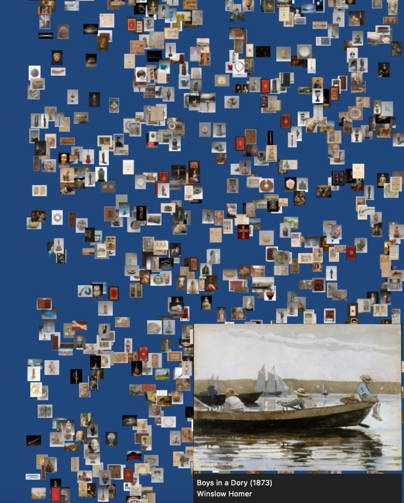
Combining his journalism and research, Conlen could see that visual forms are effective for communicating complex data sets. As a journalist, he understands the real-world constraints that HCI needs to account for in order to be useful in practice. He and Heer created Idyll, a toolkit that reduces the amount of effort and custom code required to make it easier to author and publish interactive articles, based on the challenges Conlen observed in the newsrooms in which he worked. The interactive capabilities of Idyll are seen in Unraveling the JPEG by graphics programmer Omar Shehata. Conlen explained that by using the interactive capabilities of Idyll, Shehata constructed a narrative walkthrough of the JPEG compression algorithm that connected with a big audience online — an audience that might not be interested to learn about that topic if not for the graphics that he made.
“It wouldn’t have been possible to create this system without the practical knowledge that I gained as a journalist or without the space and time to think deeply and build ambitious research systems that the Allen School affords,” Conlen said.
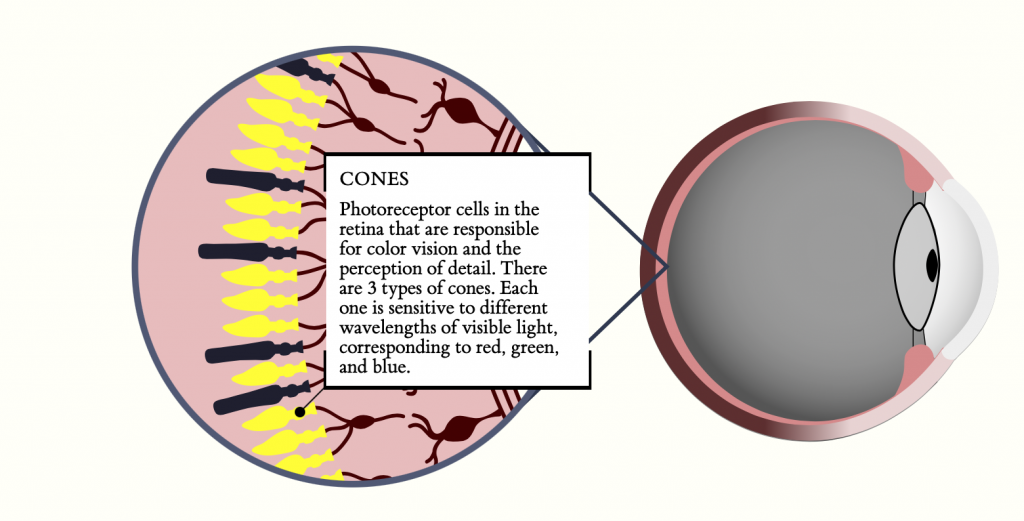
In addition to Idyll, Conlen published the Beginner’s Guide to Dimensionality Reduction, which earned a Best Paper Honorable Mention in 2018 at the IEEE Visualization and Visual Analytics Workshop on Visualization for AI Explainability. The article used interactive graphics to introduce a complex technical topic to new readers in a gentle and engaging way.

“I’m regularly impressed by the resilience of my students,” Heer, who leads the Interactive Data Lab said. “Matt’s ability to bridge the worlds of professional journalism and academic research is a standout example, animated by Matt’s commitment to a more just and better-informed society.”
After spending a year at The New York Times, Conlen returned his focus to academic research. In October he presented his paper, “Idyll Studio: A Structured Editor for Authoring Interactive & Data-Driven Articles,” at the Association for Computing Machinery’s Symposium on User Interface Software and Technology. Idyll Studio is a new graphical interface for writing interactive and data-driven stories.
“Think Microsoft Word but you can create documents that are dynamically driven by databases and include interactive visualizations and graphics,” Conlen said.
Conlen defended his dissertation last week and is currently working on a short-term contract with the New York Times. In early 2022 he will continue his work on the Idyll ecosystem — the open source project received a donation from venture capitalist Albert Wegner that will allow Conlen to put more time into improving the core project and refining Idyll Studio. He will continue doing data journalism and building tools to support that work.
To view more of Conlen’s work combining journalism and data visualization, check out his collection of published articles on his website.


